
Case Study
Libby is a free app that works with public libraries to share digital books with users.
The current design operates well but with use, it was noticed that some aspects of the interaction could be improved to create a better user experience. The team of Hyena Nam and Kelsi Turk conducted user research, evaluated responses, analyzed data, and redesigned certain aspects to increase the usability and efficiency of the app. The findings from the case study will provide more insights into user experiences with the Libby app and reveal strategies to increase the number of new users and better retain current users. The redesign focused on designing the app as used on an iPhone X.
Category
UX/UI Design
Design Research
Research Collaborator

The Process
01
Requirements
Gathering
As the Libby app has already been developed, the goal of our research was to examine if the design of the app aligned with the needs and wants of the majority of users. In order to achieve this alignment, user testing and interviews were utilized to obtain qualitative data to discover a problem space. Because Libby is a live app, we needed to identify what users find effective and intuitive and what they do not. The first user test was done using the live Libby app to make these determinations. After the user testing, we developed a persona to present about the user, her goals and current practices.
02
Design
Alternatives
The results revealed what areas are problematic for users. The ideation phase focused on what are the possible solutions that will improve the user experience so tasks can be completed in a more effective, efficient, and satisfying manner. This led us to create a data chart to pinpoint users' problem spaces; which helped us navigate viable solutions through discussion and brainstorming. After gathering ideas for the solutions, a prototype was developed for user testing.
03
Prototyping
A low-fidelity prototype was initially developed to visualize and solve the core issues related to the product’s usability and proposed functionality. After iterating the low fidelity prototype, a medium-fidelity was created, closer to the final version, to evaluate the aspects of our new design and to check if the design is meeting the desired outcomes.
04
Evaluation
The prototype was then created with a limited interface, allowing users to interact with the application. This allowed us to see how they navigated and utilized the redesign. After the user testing, the participants were asked to compare the two versions. The Usability Evaluation was focused on how well users used a product to achieve their goals. It also suggested how satisfied users were with that process.
Requirements Gathering
As the app is already created this phase of the process was not as intensive as a project that is starting from scratch. We focused on exploring the design of other reading apps as well as defining the main target audience and their technological abilities. Through digital research we determined the average user of an app such as Libby would have the following characteristics.
Findings from the User Testing & Interview
The Libby app is live so we wanted to analyze the users’ current experiences. We did look at the reviews listed on the app store but ultimately decided that having a free form discussion as a user was operating the app would result in more valuable information.
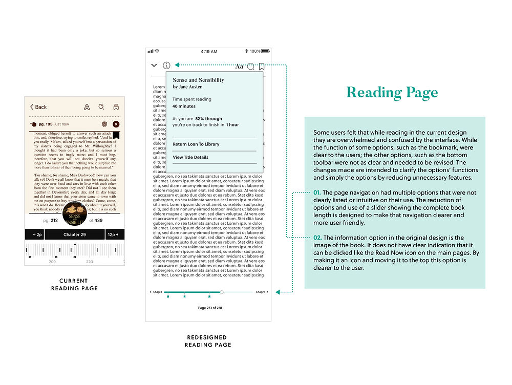
Based on the answers from the participants the Libby app does function well, however, there are aspects that were identified as confusing or cumbersome. Based on our analysis of the responses we considered that the app would be improved for better user experience if we examine and refine the areas that do not effectively meet users' needs. We found the homepage (Library page) and the reading page were the most problematic and could be improved for more effective navigation of the menus and options. These interactions are important for the function of the app as the homepage is the first page that users begin their experience and leads to fulfill the user’s goal: convenient and comfortable reading. These aspects became the focus of the redesign. The experience of exploring was liked by users and it appeared to not need changes. However, as we created iterations for the homepage, we realized the Explore page would have to change slightly to elevate users' searching tasks.

Design Alternatives
From the users’ response and our analysis, we created a Semantic Profile as a clear visual for our focus. We brainstormed potential solutions to provide an improved user experience with the Libby app based on the information gathered from the persona, the Profile, and researching other reading apps. From there we created a prototype that we believed would be more aligned with the main users and their needs, therefore, more useful and usable for users to complete their tasks.

Prototyping

Evaluation
We conducted a second round of user testing to compare the experiences the users had. The users were forewarned that the prototype had limited capabilities compared to the original design. The users expressed satisfaction that the issues that limited the friendliness and intuitiveness of the original design had been addressed. After each user had finished testing, we asked them to rate on a scale 1 to 10 how friendly did they find each design.


Final Deliverables
High Fidelity Prototype
The feedback from the second user testing was overwhelmingly positive so the design was finalized and refined for a final presentation. If you would like to experience the redesign please click here.

Insights from the Case Study
Creating a redesign comes with unique boundaries. We aimed to create solutions that would integrate and work well with the current version of the Libby app as well as be more functional for the users. The balance of integration, appeal, and functionality resulted in a blend of keeping some pages, simplifying others, and having broad redesigns for a few. This project highlighted how important it is to look for what works and what improvements can be incorporated without creating new issues when looking at existing applications. And if there is a need for an update, a project must be both consistent and clear in order to benefit the user.


